
Finding the safest neighborhood in London with DataStudio
1. Getting our data and process it
Following step 1 to step 4 from the previous post, we should have our aggregated data table ready.
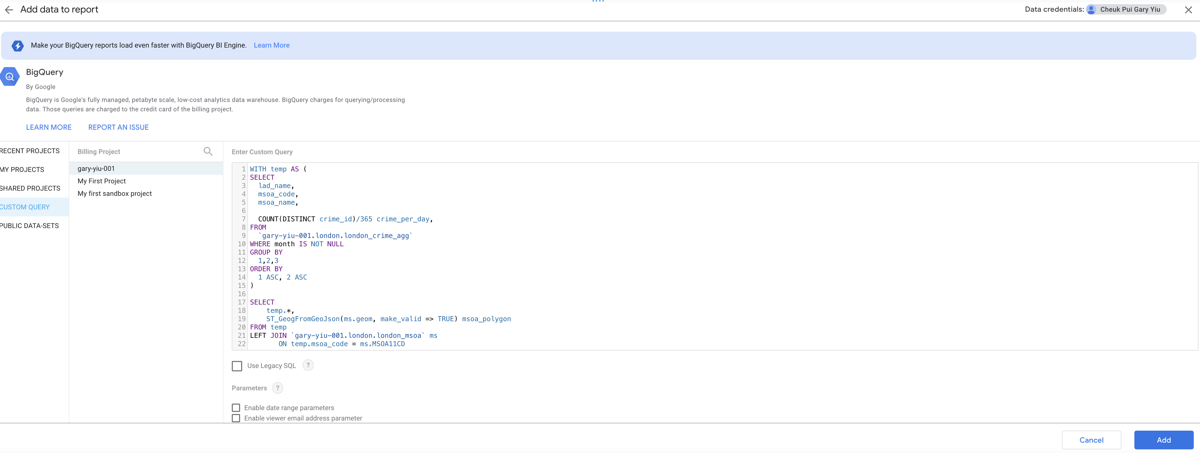
WITH temp AS (
SELECT
  lad_name,
  msoa_code,
  msoa_name,

  COUNT(DISTINCT crime_id)/365 crime_per_day,
FROM
  `gary-yiu-001.london.london_crime_agg`
WHERE month IS NOT NULL
GROUP BY
  1,2,3
ORDER BY
  1 ASC, 2 ASC
)

SELECT
    temp.*,
    ST_GeogFromGeoJson(ms.geom, make_valid => TRUE) msoa_polygon
FROM temp
LEFT JOIN `gary-yiu-001.london.london_msoa` ms
       ON temp.msoa_code = ms.MSOA11CD
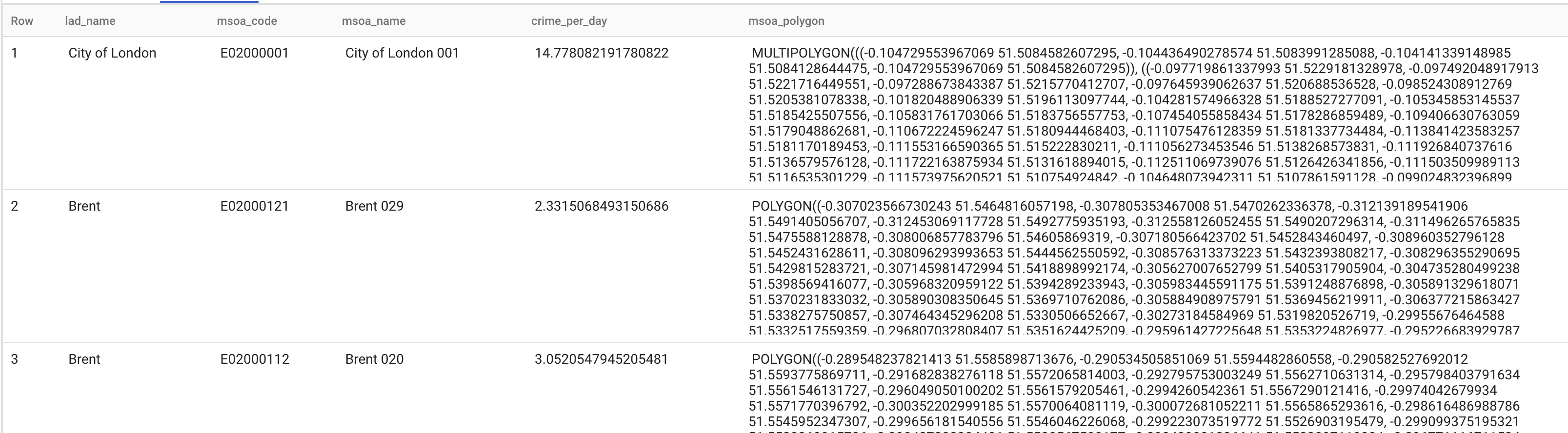
We got four columns in our data:
- lad_name: it’s the borough name in London, there are multiple MSOA areas within a borough.
- msoa_code: unique identifier of each MSOA area
- msoa_name: name of each MSOA area
- crime_per_day: number of crime committed in a day over 365 days in 2021
- msoa_polygon: the polygon data in GEOGRAPHY type which help us to visualize the data in data studio.
2. Import data in Data Studio
After data preparation, we can head to data studio and import the data. In data studio, create a new report and click BigQuery when it prompts to add data source. Select custom query and billing project then paste over the query. Click add to proceed.
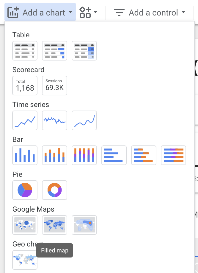
3. Adding Google Maps chart
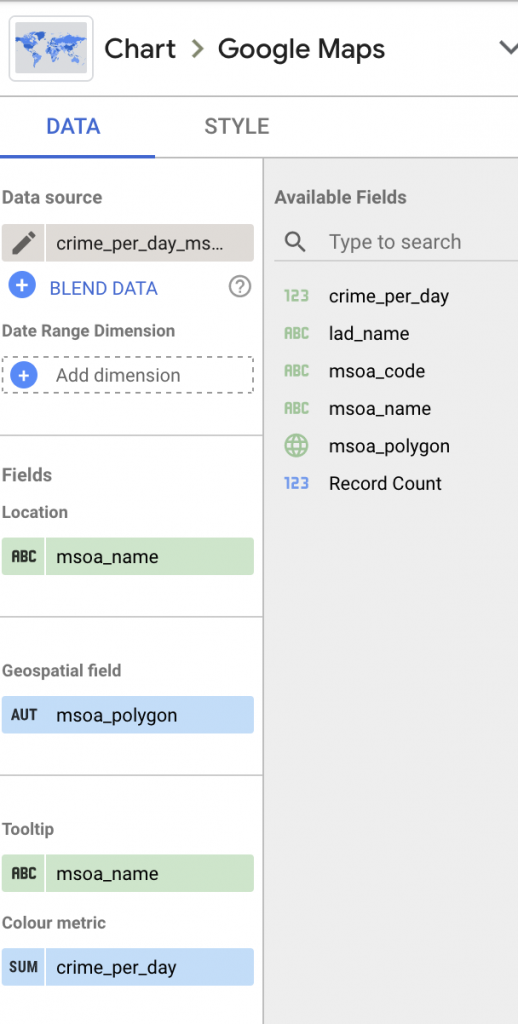
Click add a chart and select filled map, use msoa_name as location and msoa_polygon. The map should be able to load. Then go ahead to set the tooltip using msoa_name and colour metric with crime_per_day, so we can set a colour gradient to visualize the number of crimes in a district.
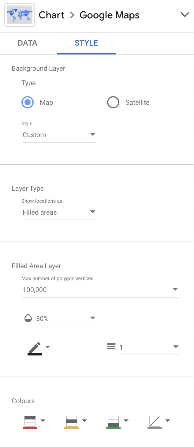
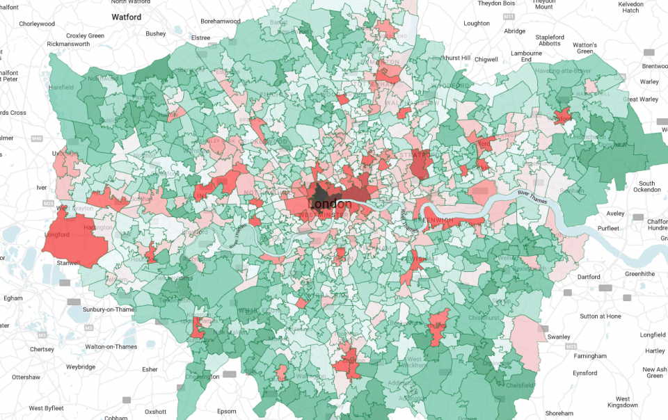
In style tab we also need to set the max, median and min colour to make the visualization work. We might as well set opacity of the filled area to 30%. Now we should have a beautiful map dissected to MSOA level districts like this.
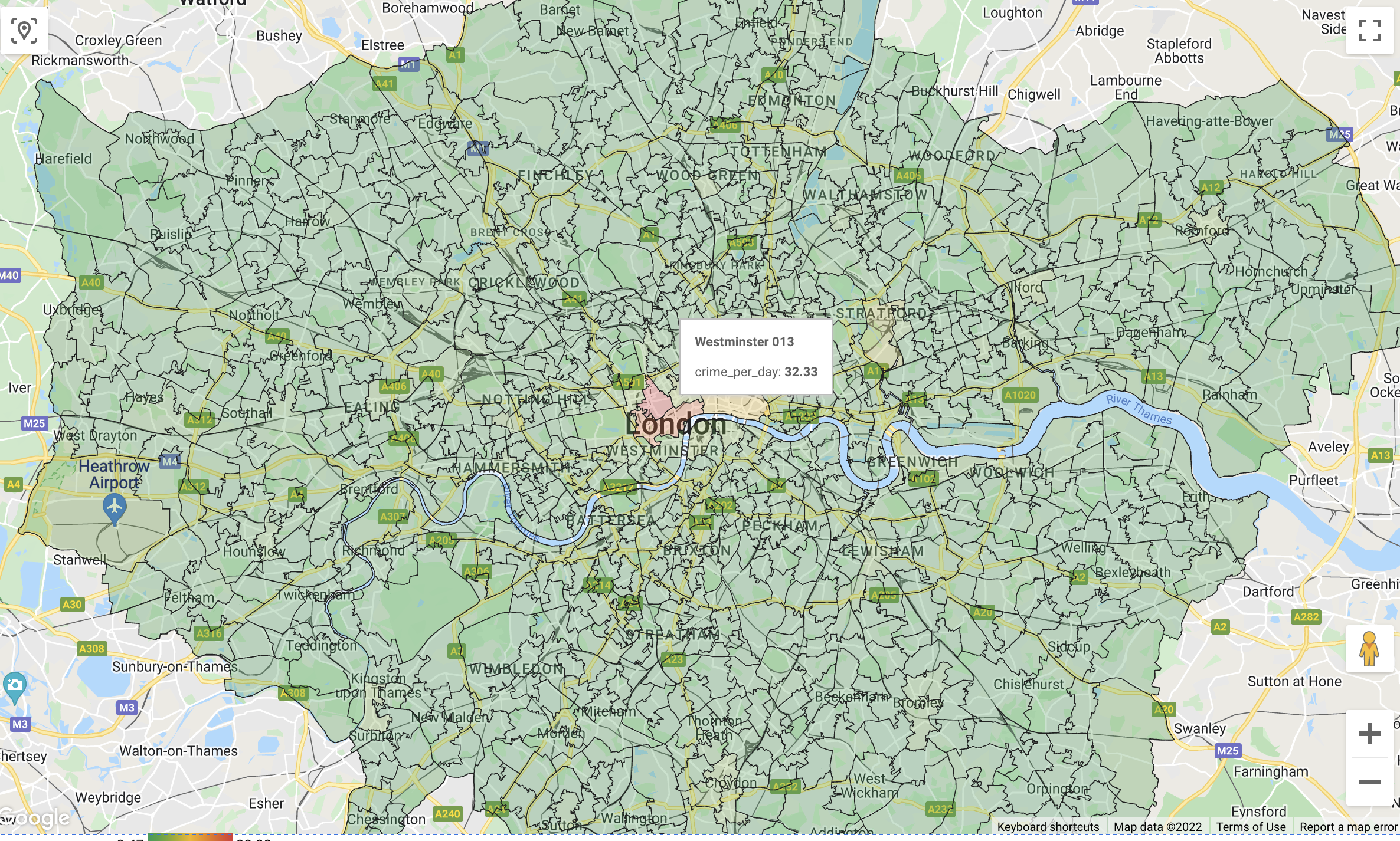
We can explore a bit on the map to see Westminster 013 has a pretty high crime number of 32 per day which make sense since it is the most crowded area in London. But we also see a problem of our visualization that is we don’t have a reference on what is high and what is not. Let’s also create some score cards to show the basic information on the dashboard.
3. Adding Scorecards
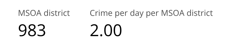
First we want to know how many MSOA district are there. Click add a chart, then add score card. Drag msoa_code from available fields. By default it should be counting distinct MSOA code already, let’s rename it to MSOA district. We can see there are 983 MSOA zone in London.
Next it will be useful to know the average number of crime committed daily in each zone. Add another score card using the crime_per_day field, set “Average” as the aggregation method.
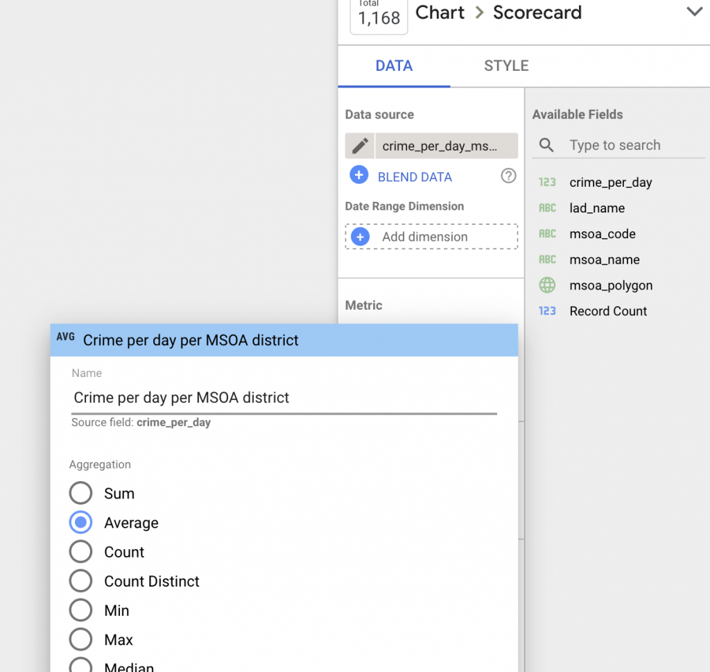
Nice, now we know the average crime committed daily is 2 which means the crime number in Westminster 013 is extremely high comparatively.
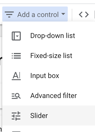
4. Adding controls to the dashboard
We should have a good overview of the number of crime in different districts. Let’s add some controls to our dashboard for narrow down the districts by number of crimes daily.
Click add a control, then select slider. Using the crime_per_day field as the control field. We can use it to filter out areas that have number of crime over/below a specific number.
For example we select 6 as the upper limit of the filter, applying the filter we can see most of the central London areas are uncoloured being the more crime prone areas.
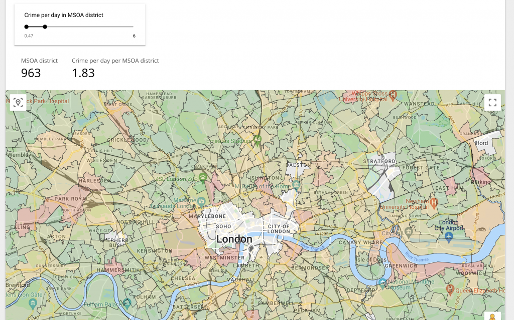
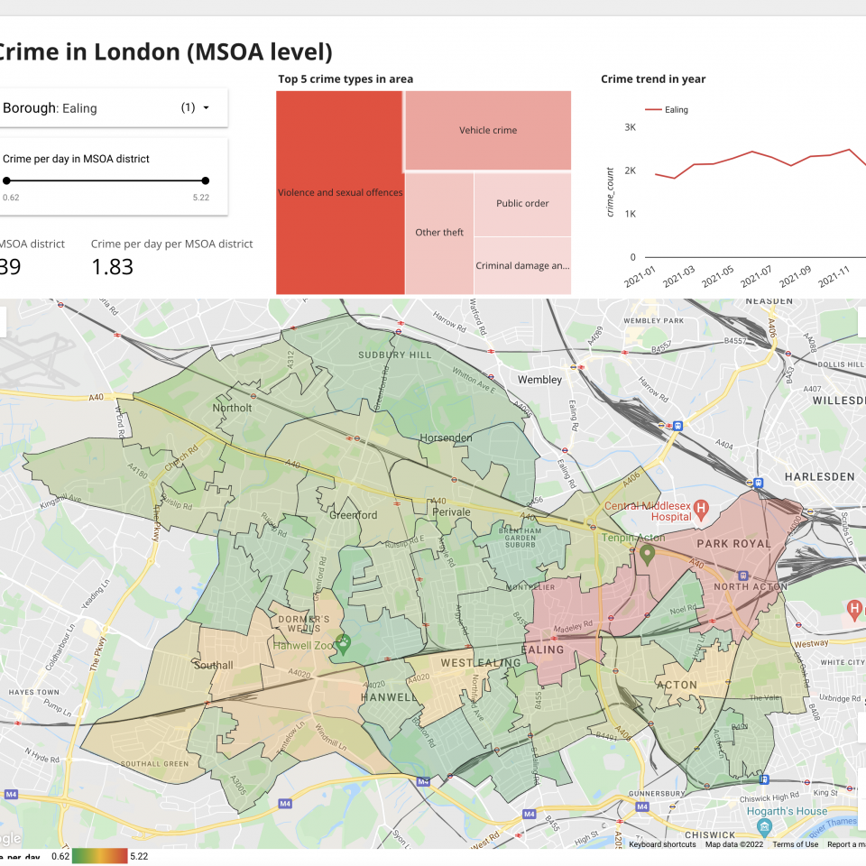
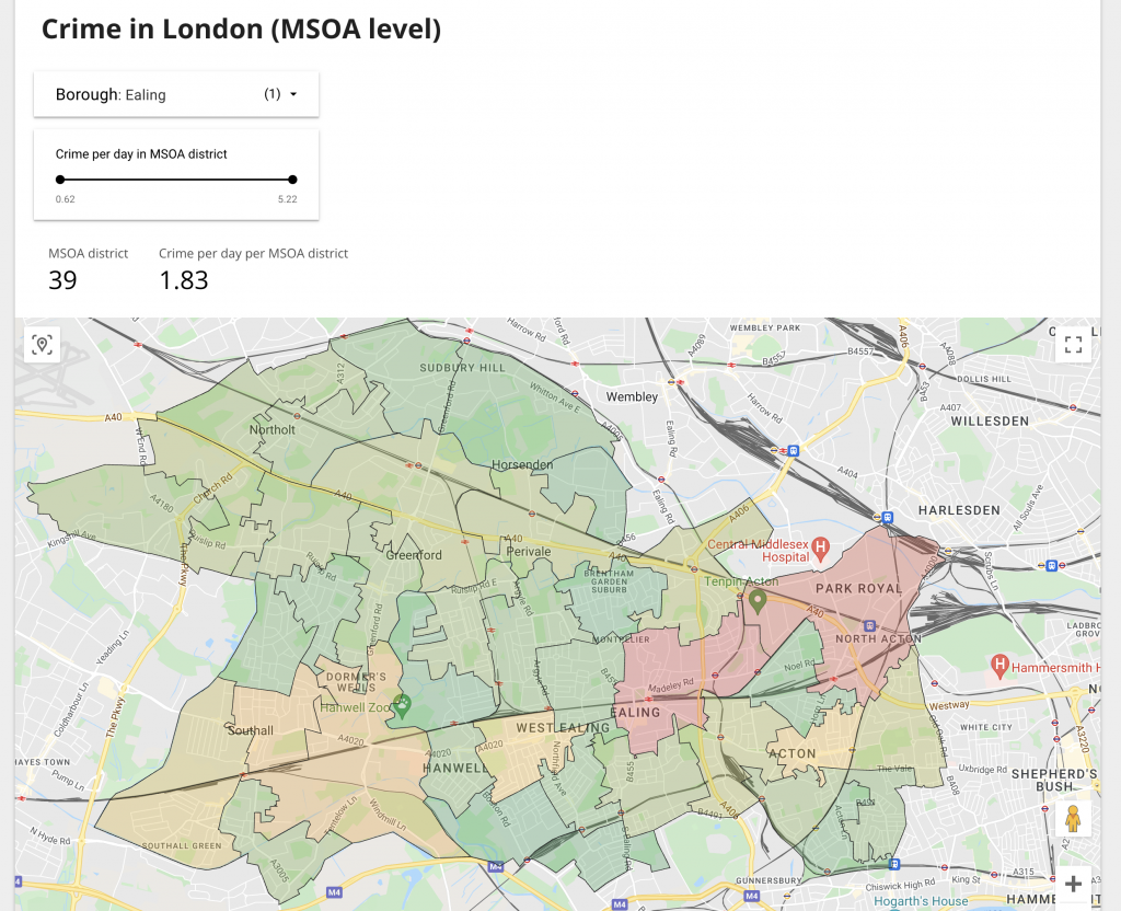
Next let’s add another control to filter specific borough for scenario where we need to analyze only specific borough. This time we use a drop down list and lad_name as the control field. After setting up, pick “Ealing” from the list and press “Only” to filter. We can see some areas are in red meaning these areas are less safe than others.
5. Adding more visuals to the dashboard
We have the controls and the map setup. But now we also want to know more about the specifics of these crime, like what the majority of all the crime are committed in a particular area and the trend of crime committed in a borough over the year. These can be done by adding a tree map and a line chart.
With the tree map, we set the crime_type as the dimension and the crime_count as the metric. Then set the total rows to 5. For the line chart, we set month as dimension, lad_name as the breakdown dimension and the crime_count as metric. Voila, we have a pretty complete dashboard.
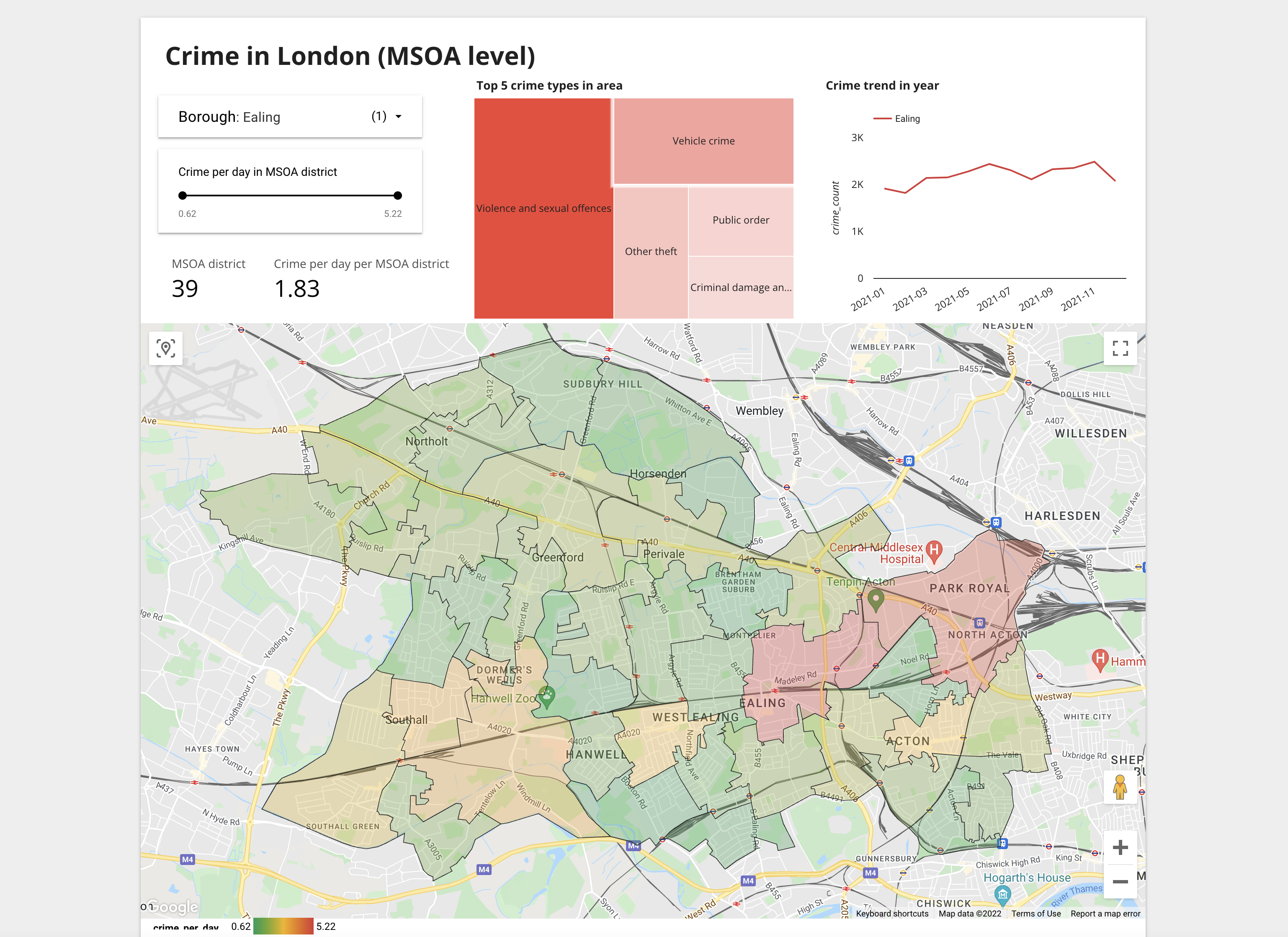
We can see in Ealing, there are 39 MSOA districts averaging 1.83 crimes per day. The top crime committed is violence and sexual offences with vehicle crime and other theft behind. Trend throughout the year is rather stable with uptrend during June and November.
Conclusion
We have created a pretty decent dashboard using public data from the authority. Starting from processing the raw data all the way to visualization.