
Introduction
As an avid football fans, it is always exciting to any kinds of analysis that give me insights on how teams can play better.
Recently a term “expected goal(xG)” is very popular among fans, commentators and pundits, then i read an analysis by Austin W.. He did an analysis based on a R package understatr which grab the xG data from the site understat. The analysis is simple and interesting. I was inspired to do one as well focusing on the Manchester United team.
Packages import
library(tidyverse) # metapackage of all tidyverse packages
library(awtools)
library(understatr)
library(ggforce)
library(ggrepel)
Expected goals for and against
To start with, we can take a look how many expected goals for(xG) and expected goals against(xGA) the Manchester United team have for each match in the season. The EPL league data is first grabbed using ‘get_league_teams_stats’ function in understatr package. Then the data is filtered to get only ManUtd data, little change on the data is done to add the week number to each row.
team_data <- get_league_teams_stats('EPL', year=2021)
team_data_manutd <- team_data %>%
  filter(team_name == 'Manchester United') %>%
  mutate(week = row_number())
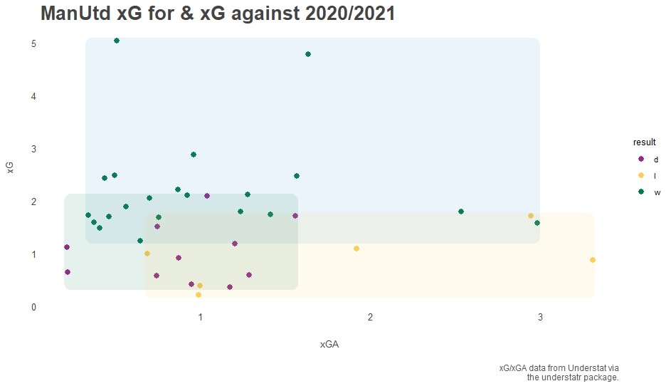
After we get the data, we plot a graph with xG vs xGA. We can see that the more xG Man Utd team have, the more likely the team is going to win which is expected. Majority of wins happened when the team has more than 1.5 xG and less than 1.5 xGA in a match.
#xG and xGA relations on match results
ggplot(team_data_manutd,aes(x=xGA,
           y=xG,
           color = result)) +
  geom_point(size=2.5) +
  geom_mark_rect(aes(fill = result),
                    alpha=.1,
                    color=NA,
                    expand = unit(1, "mm"),
                    show.legend = FALSE) +
  a_secondary_color() +
  a_flat_fill() +
  a_plex_theme(grid = FALSE,
               base_size = 10)  +
      labs(title='ManUtd xG for & xG against 2020/2021',
         x='xGA',
         y='xG',
         caption='xG/xGA data from Understat via\nthe understatr package.')
Media and the community was rather focused on Man Utd performance’s relation to the number of penalties the team was getting in the season. So I thought it might be interesting to see the non-penalty expected goals for versus against. The result did prove that penalties are actually an important part of the team’s performance.
#npxG and npxGA relations on match results
ggplot(team_data_manutd,aes(x=npxGA,
                            y=npxG,
                            color = result)) +
  geom_point(size=2.5) +
  geom_mark_rect(aes(fill = result),
                    alpha=.1,
                    color = NA,
                    expand = unit(1, "mm"),
                    show.legend = FALSE) +
  a_flat_color() +
  a_flat_fill() +
  a_plex_theme(grid = FALSE,
               base_size = 10)  +
  labs(title='ManUtd npxG for & npxG against 2020/2021',
       x='npxGA',
       y='npxG',
       caption='npxG/npxGA data from Understat via\nthe understatr package.')
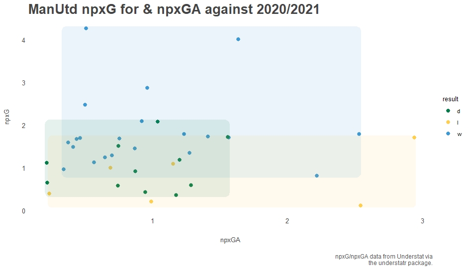
Majority of the matches played falls within the same region in the visualization meaning the match result would be inconclusive if penalty was disregarded.
Expected goal for and DEEP
If the team is relying on penalties that much, it will be interesting to take a look at the number of passes happening within 20 yards from goals (DEEP).
#xG and deep relation on match results
ggplot(team_data_manutd, aes(x=deep,
                             y=xG,
                             color=result))+
  geom_point(size=2.5) +
  geom_mark_rect(aes(fill = result),
                 alpha=.1,
                 color = NA,
                 expand = unit(1, "mm"),
                 show.legend = FALSE) +
  a_secondary_color() +
  a_secondary_fill() +
  a_plex_theme(grid = FALSE,
               base_size = 11)  +
  labs(title='ManUtd xG & deep for 2020/2021',
       x='deep',
       y='xG',
       caption='xG/deep data from Understat via\nthe understatr package.')
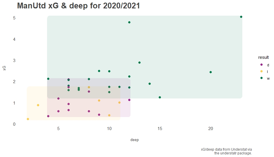
The result is quite interesting as it shows a positive relation on xG and DEEP meaning if the team has more passing within the penalty area, the team is more likely to score. It also aligns with the performance relation to the amount of penalty the team was getting, when the team is creating more close range passes, it is obvious that the team is more likely to get a penalty.
Players’s xG and xA
As we are looking into team statistic, it will be interesting to see individual performance of each players particularly their contributions on xG and xA. Here I only want to see players who have any goals/assists with a considerable amount of playing time (>500 minutes) and since we are looking at xG and xA, it wouldn’t be fair to include goalkeepers and defenders, thus I created a filter based on the above.
#ManUtd average xG/XA per 90 minutes 2020
player_data_manutd <- get_team_players_stats(team_name = "Manchester United", year = 2020) %>%
  mutate(avg_xG_per_min = xG / (time/90) ) %>%
  mutate(avg_xA_per_min = xA / (time/90) ) %>%
  filter(goals != 0 & assists != 0) %>%
  filter(position != "GK" & time >= 500) %>%
  filter(position != 'D')
The average xG and average xA are calculated by using the xG/xA divided by time played per 90 minutes. Some mutation on the data was done to achieve this.
ggplot(player_data_manutd, aes(x=avg_xA_per_min,y=avg_xG_per_min)) +
  geom_point(stat ="identity",color='#777777') +
  geom_text_repel(aes(label=player_name),color='#777777')+
  a_plex_theme(
    grid = FALSE,
    base_size = 10)  +
  labs(title='ManUtd average xG/XA per 90 minutes 2020/2021',
       x='average xA',
       y='average xG',
       caption='xG/xA data from Understat via\nthe understatr package.')
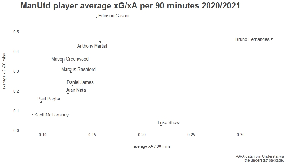
We can see Edison Cavani has the highest average number of xG which means he has very good positioning and is always there when the chance arises. Burno Fernandes comes in second. Anthony Martial occupied the third place. Among the forwards in the team, Marcus Rashford ranks in the last.
Bruno Fernandes is the best overall player in the team with plenty of xG and xA.
Player’s efficiency
Just looking at xG and xA can be good indicators of good positioning and passing, however, to have a better picture on player performance we should also compare these metrics with actual goals/assists the players have.
To achieve this, I did some calculations using xG/xA and actual goals/assists to define the goals efficiency and assist efficiency. Player’s with efficiency value higher than/equal to 1 is considered ‘Efficient’, otherwise they will be considered ‘Inefficient’.
# ManUtd players efficiency on goals
player_goal_eff_manutd <- player_data_manutd %>%
mutate(goals_efficiency = goals/xG) %>%
mutate(assists_efficiency = assists/xA) %>%
mutate(goals_efficient = case_when(goals_efficiency>=1 ~ 'Efficient'
,TRUE ~ 'Inefficient'))%>%
mutate(assists_efficient = case_when(assists_efficiency>=1 ~ 'Efficient'
,TRUE ~ 'Inefficient'))

ggplot(player_goal_eff_manutd, aes(x=time/90,y=goals_efficiency, color=goals_efficient)) +
geom_point(stat ="identity") +
geom_text_repel(aes(label=player_name), color='#4c4c4c')+
a_plex_theme(
grid = FALSE,
base_size = 10) +
a_secondary_color() +
labs(title='ManUtd players goals efficiency 2020/2021',
x='Time played / 90 minutes',
y='Goal efficiency',
caption='Goals/assists data from Understat via\nthe understatr package.')
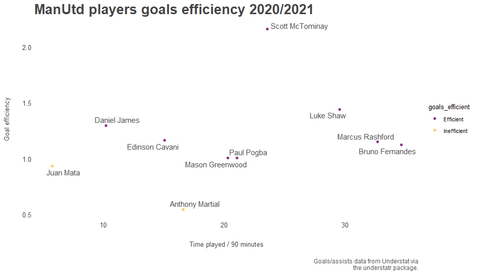
We can see most of the players are quite efficient on goals but Donny van de Beek is particularly high on efficiency which might not accurately reflect his performance as his goal score and xG is low. Scott McTominay ranks second in goal scoring efficiency when is outstanding as a midfield player compared to Paul Pogba in the same position.
Anthony Martial, who has a high xG number mentioned in the previous section, has a disappointing efficiency as his number of goals scored is low.
Conclusion and recommendation
- Penalty is an important part of Man United team performance
- Man United’s style of play involves numerous passes inside the box which can leads to more penalty awarded
- Edision Cavani’s positioning is outstanding and he is the best in the team
- Marcus Rashford should improve his positioning to create more goal scoring chances
- Daniel James should be given more time on pitch as he is an effective player but he only played 10 matches worth of game time
- Scott McTominay should get forward more often as he is an effective goal scorer
- The team should let go of Anthony Martial as he is ineffective as a forward player
This is a very interesting analysis as football is my passion and it is only possible thanks to understat and Austin W.’s analysis that inspired me to do this. I might do another analysis on teams overall performance or star players performances in the league just because it is fun to do it.