

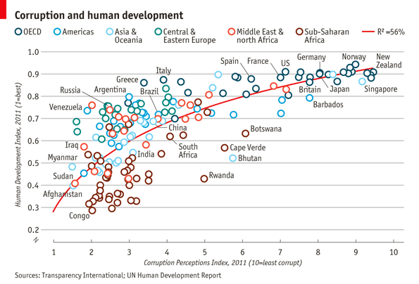
I’ve been working on my visualization skills in R with some online courses. I came across this visualization from Economist from a while back and recreated it using R.
Firstly , we load the packages needed to recreated the visualization.
#visualization project
library(ggplot2)
library(tidyverse)
library(ggrepel)
library(awtools)
Then we load our data and preview a few lines of the data. The structure is checked and verify no missing data in the data set.
df <- read.csv("Economist_Assignment_Data.csv")
head(df)
str(df)
df[!complete.cases(df),]
As we can see there are plenty of marked locations in the original visualization, we need to specify them in a vector before we can do that creating the visualization.
pointsToLabel <- c("Russia", "Venezuela", "Iraq", "Myanmar", "Sudan",
"Afghanistan", "Congo", "Greece", "Argentina", "Brazil",
"India", "Italy", "China", "South Africa", "Spain",
"Botswana", "Cape Verde", "Bhutan", "Rwanda", "France",
"United States", "Germany", "Britain", "Barbados", "Norway", "Japan",
"New Zealand", "Singapore")
Then we can start constructing our visualization using ggplot2.
pl <- ggplot(df,aes(x=CPI,y=HDI))

pl2 <- pl + geom_point(aes(colour=Region), shape=21, size = 5) +
geom_smooth(aes(group=1), method = 'lm',formula = "y ~ log(x)", se= FALSE, color = 'red') +
geom_text_repel(aes(label=Country), color = "#404040", box.padding = 1,
data = subset(df, Country %in% pointsToLabel))

pl2 +
scale_x_continuous(limits = c(1,10), breaks=1:10) +
scale_y_continuous(limits = c(0.2,1), breaks=c(0.2,0.4,0.6,0.8,1.0)) +
a_primary_color() +
a_plex_theme(grid = FALSE,axis_text_size = 10) +
theme(legend.position = 'top') +
labs(title = "Corruption and human development",
x='Corruption Perceptions Index, 2011 (10=least corrupt)',
y='Human Development Index, 2011 (1=best)',
caption='Sources: Transparency International; UN Human Development Report')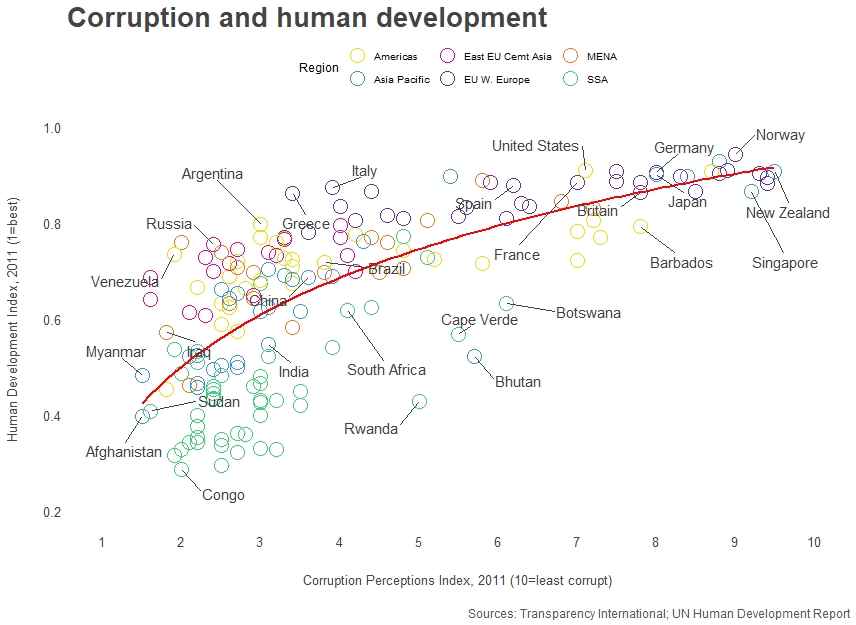
Voilà! Here we got our recreation of the Economist visualization on ‘Corruption and human development’.