

Introduction
The COVID-19 pandemic has already affected our live for more than a year. Vaccine is also made available the fastest ever for any kind of disease ever happened to mankind. Some people might still have doubt on the safety of the new vaccine, although some of the vaccine might have caused different kind of serious side effect, no one would deny it is the only way for the world to get out of the pandemic.
As the data of people getting vaccine across the world is made available by Our World in Data and Bojan, I decide it would be great to answer the one single question with the data:
Is the vaccine effective to reduce the number of new cases and death cause by the COVID-19 disease?
Packages import
#Required packages
library(tidyverse)
library(ggthemr) #theme
library(ggplot2)
library(ggrepel)

ggthemr('light', type = 'outer', spacing = 2)
Preparation of data
First we load our data and set the theme of the ggplot using ggthemr. Since I’m from Hong Kong, I want to filter the data to analyse the situation in Hong Kong. We use head function to inspect just the first few line of the data and str function to check the data structure.
Then select the columns that are useful to our analysis. I mainly selected number of cases, number of death, number of vaccination given and the population of the location.
covid_data <- read.csv("../input/data-on-covid19-coronavirus/owid-covid-data.csv")
hk <- covid_data %>%
  filter(iso_code == "HKG")
head(hk)
str(hk)
hk_filter <- hk %>% select(iso_code, date, total_cases, new_cases, total_deaths, new_deaths, total_vaccinations, people_vaccinated, people_fully_vaccinated, new_vaccinations, population)
Process and clean the data
As the data cover the metric since the first case, those data before vaccination started are irrelevant to our analysis. Thus we filter out the data when the number of total vaccination is NA. Then we clean up the fitered data by renumbering the row and check if all the fields in the data are completed. Finally, assigning all NA data field to 0.
#Local records only after vaccination has started
hk_vac_filter <- hk_filter[!is.na(hk_filter$total_vaccinations),]
#Renumber the row
rownames(hk_vac_filter) <- NULL
#Local records that have incompleted fields
hk_vac_filter[!complete.cases(hk_vac_filter),]
#Replace incompleted fields with 0
hk_vac_filter[is.na(hk_vac_filter$people_fully_vaccinated),"people_fully_vaccinated"] <- 0
hk_vac_filter[is.na(hk_vac_filter$new_vaccinations),"new_vaccinations"] <- 0
head(hk_vac_filter)
Analyze the data
We can now start our analysis. First we need to format the date field in the data to POSIXct date. Then we calculate the percentage of the vaccinated population to get an idea of how many people are vaccinated over time.
#Format date in the data
hk_vac_filter$Posixdate <- as.POSIXct(hk_vac_filter$date, format="%Y-%m-%d")
#Calculate percentage of vaccinated people
hk_vac_filter$PercentVaccine <- hk_vac_filter$people_vaccinated / hk_vac_filter$population *100
str(hk_vac_filter)
Visualization
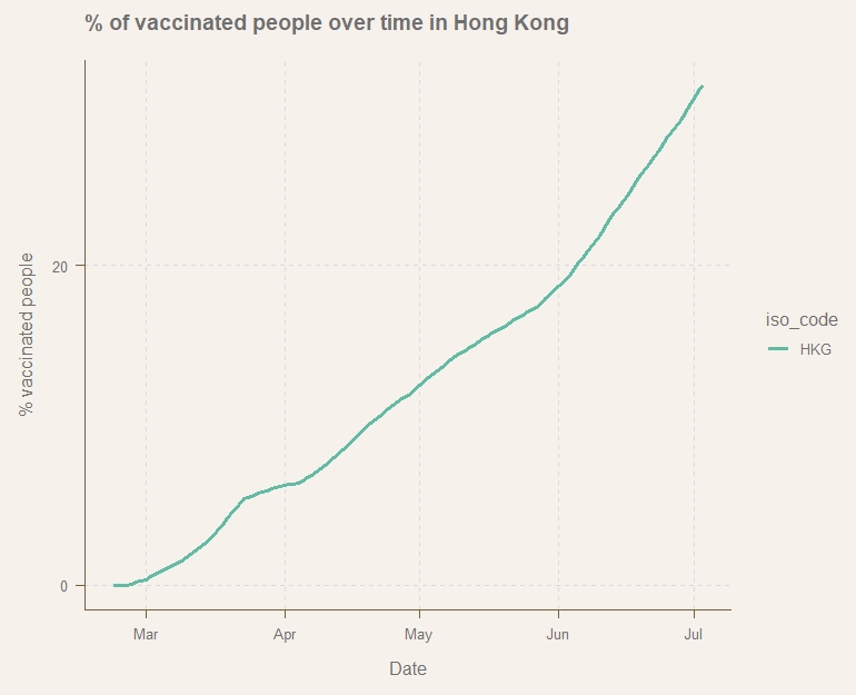
Data is ready to be visualised. We use ggplot to plot graph of percentage of total vaccinated people and number of new cases to see if vaccination does get the case number down.
We can see from the viz, as the % of total vaccinated people increase, the number of new cases does start to flat out. It might conclude that vaccination is effective to reduce transmission of COVID-19.
p1 <- ggplot(data = hk_vac_filter, aes(x=Posixdate,y=PercentVaccine, colour=iso_code))
p1 + geom_line(size=1.2) +
  scale_y_continuous(breaks=c(0,20,40,60),labels = scales::comma) +
  labs(title = "% of vaccinated people over time in Hong Kong",
       x='Date',
       y='% vaccinated people')
p2 <- ggplot(data = hk_vac_filter, aes(x=Posixdate,y=total_cases, colour=iso_code))
p2 + geom_line(size=1.2) +
  labs(title = "Total number of cases over time in Hong Kong",
       x='Date',
       y='Total number of cases')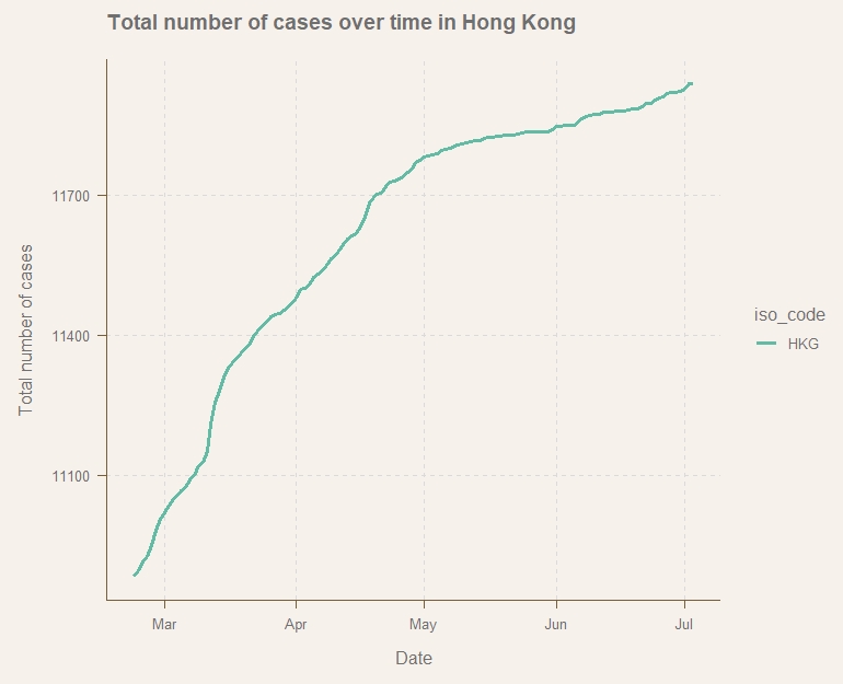
Although we can see some sort of relation between vaccine and number of new cases, just looking at HKG is not enough to make a conclusion as different locations have different precaution measures and are using different vaccine.
I decide to also look at different countries from the world (Brazil, U.K., India, Isreal, USA).
#Repeat process with added countries
comb <- covid_data %>%
  filter(iso_code %in% c("HKG","GBR","USA","ISR","BRA","IND"))
comb_filter <- comb %>% select(iso_code, date, total_cases, new_cases, total_deaths, new_deaths, total_vaccinations, people_vaccinated, people_fully_vaccinated, new_vaccinations, population)

#Local records only after vaccination has started
comb_vac_filter <- comb_filter[!is.na(comb_filter$total_vaccinations),]
rownames(comb_vac_filter) <- NULL
comb_vac_filter[!complete.cases(comb_vac_filter),]
comb_vac_filter[is.na(comb_vac_filter$people_fully_vaccinated),"people_fully_vaccinated"] <- 0
comb_vac_filter[is.na(comb_vac_filter$new_vaccinations),"new_vaccinations"] <- 0
One point to note here when cleaning data on USA: The number of total vaccination on 13JAN is missing, thus I compute the number using the average of 12JAN and 14JAN.
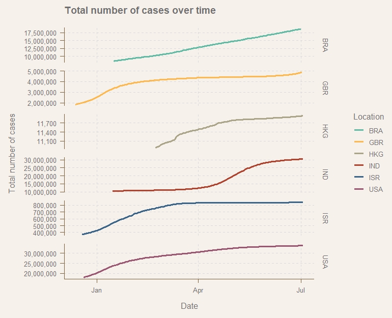
#USA has a missing data on 13JAN2021, BRA has missing data on 23JUN2021 comb_vac_filter[!complete.cases(comb_vac_filter),] #Replace with average of +1/-1 date comb_vac_filter[comb_vac_filter$iso_code=="USA" & comb_vac_filter$date=="2021-01-13", "people_vaccinated"] <- (comb_vac_filter[comb_vac_filter$iso_code=="USA" & comb_vac_filter$date=="2021-01-12", "people_vaccinated"]+comb_vac_filter[comb_vac_filter$iso_code=="USA" & comb_vac_filter$date=="2021-01-14", "people_vaccinated"])/2 comb_vac_filter[comb_vac_filter$iso_code=="BRA" & comb_vac_filter$date=="2021-06-22", "people_vaccinated"] <- (comb_vac_filter[comb_vac_filter$iso_code=="BRA" & comb_vac_filter$date=="2021-06-21", "people_vaccinated"]+comb_vac_filter[comb_vac_filter$iso_code=="BRA" & comb_vac_filter$date=="2021-06-23", "people_vaccinated"])/2 #check: comb_vac_filter[765,] comb_vac_filter[140,] #Format date in the data comb_vac_filter$Posixdate <- as.POSIXct(comb_vac_filter$date, format="%Y-%m-%d") #Calculate percentage of vaccinated people comb_vac_filter$PercentVaccine <- comb_vac_filter$people_vaccinated / comb_vac_filter$population *100 p3 <- ggplot(data = comb_vac_filter, aes(x=Posixdate,y=PercentVaccine, colour=iso_code)) p3 + geom_line(size=1.1)+ scale_y_continuous(breaks=c(0,20,40,60,80,100),labels = scales::comma) + labs(title="% vaccinated people over time", x="Date", y="% vaccinated people", colour = "Location")p4 <- ggplot(data = comb_vac_filter, aes(x=Posixdate,y=total_cases, colour=iso_code)) p4 + geom_line(size=1.1) + facet_grid(iso_code~., scales = "free") + scale_y_continuous(labels = scales::comma) + labs(title = "Total number of cases over time", x='Date', y='Total number of cases', colour = "Location")
Conclusion and further studies
As we can see from the time series graph, several countries(U.K., Israel and USA) have their total number of new cases flat out after a majority of population has been vaccinated. It is not the case for Brazil and India though, Brazil’s number of new cases did not flat out but continue to increase at its original pace, India had a huge clutter in May and June.
Next step of the analysis shall investigate the vaccine used by different countries. It is obvious the vaccine is helping to reduce the transmission but we want to know why it is working in some countries but not in some.